A proposal deadline is looming. You’ve spent time putting the content together and think you have a winning strategy. Now, your thoughts turn to the graphics. You haven’t included any imagery or diagrams or laid out your overall strategy in visuals. You wonder if it’s worth it.
I’m here to tell you that having your concepts laid out in easy-to-follow graphics that support the content can be critical.And that's the purpose of this blog: to share my knowledge and experience in business-winning graphics with everyone—or at least with those who want to win more bids.
So, a little about me. I work as a Graphic Design Consultant (Shipley qualified) specialising in developing graphics for #winning proposals.
I have accumulated 20+ years of experience in the graphics space. Has it been that long? (Looks out the window and sighs).

I've worked in law firms, banking, technology, and the insurance sector, where I grew professionally. In addition to working on tenders and pitches, I worked with communications and marketing specialists on their campaign materials while leading a design team.
Do you want to know one of the most important lessons I've learned after putting my 20 hard years into my craft? The one thing I'd like to tell every lawyer, banker, techie, and insurer working on significant bids?
Graphics make your proposal worth reading and will make you stand out from the competition!
I’m not talking about just making your document look pretty because graphics do so much more than that!
I remember attending a meeting where some content provided wasn’t up to scratch. "Can you just make it pretty?" Someone in the room said, “you can’t put lipstick on a pig". Laughter filled the room. But they were right! No matter how much you dress up the content it won’t help if it wasn't good to begin with!

Never choose looks over substance. Instead, choose looks and substance.
Even if you believe your solution is the best, you don’t want your proposal overlooked because you didn't go the extra mile to illustrate your ideas graphically.
Graphics need to be well thought out and executed, and it is amazing what good graphics can do:
- Convey both facts and emotions
- Improve the retention and understanding of information
- Effect decision making
- Highlight important information you want to stand out
- Enable quick and easy comprehension of the content
According to research by 3M - the developers of Post-It notes - visual aids have improved learning by up to 400%! And that humans can process visuals 60,000 times faster than text!
Ask yourself:
- What are you trying to achieve?
- What is the solution you want to offer to the customer?
- How can you convey the solution in graphics that are easy to read and understand?
If you're still not convinced, here is a proposal snapshot with and without Graphics:
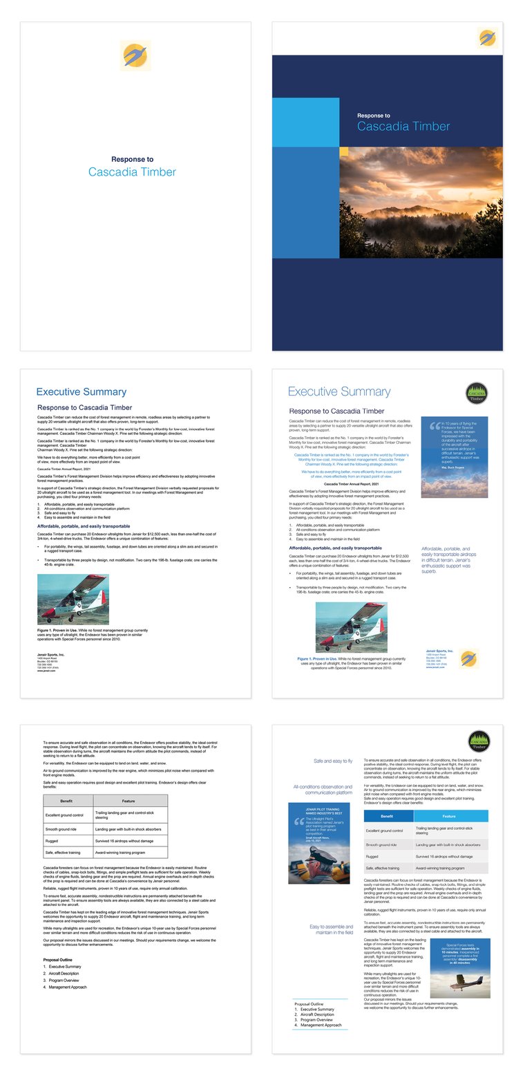
Now, be honest: which would you choose?
If you want to strengthen your proposal-winning graphics, download the Proposal Graphics Checklist, which highlights the four key graphic elements:
- Content
- Clarity
- Spacing
- Colour
Together, let's change the way people see graphics in their proposals and learn how to use them to help you win business effectively.
Vive la résistance!